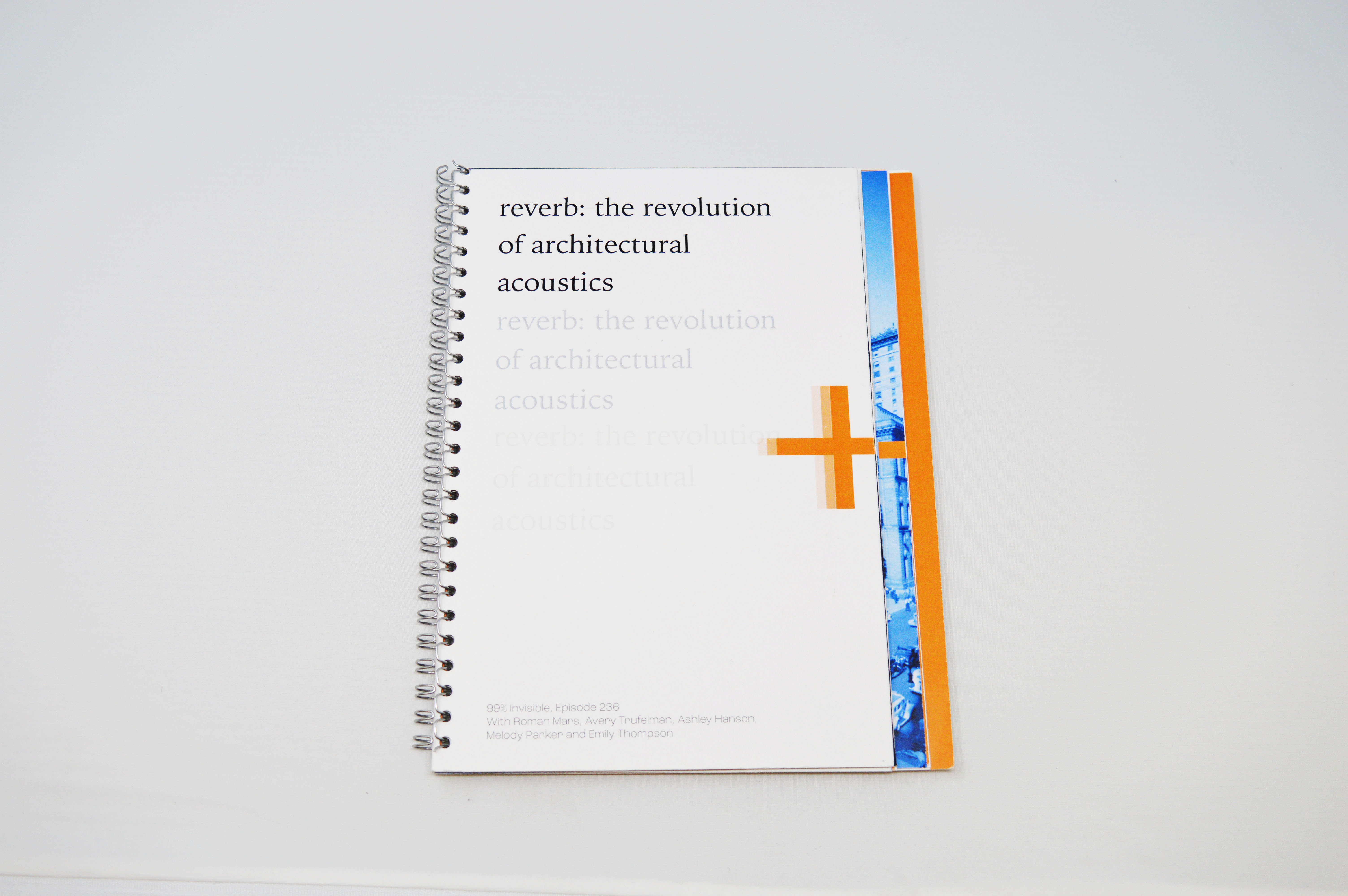
reverb podcast accompaniment book
A book designed to accompany podcast 99% Invisible's episode 236 "Reverb: The Evolution of Architectural Acoustics". Through its layered page construction, its visual motifs of echo and leaving behind imprints, and its architectural sketches/blueprints and sound visualizations, I bring the topic of reverb and how spaces are designed to affect sound physically to the reader.
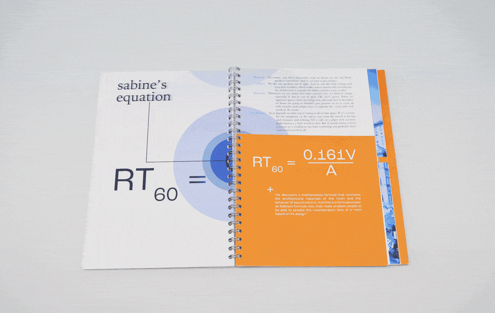
With this book design, I wanted to demonstrate the connection between the architecture of a space and the reverb/sound design of a space. The podcast goes deep into the science and math of how certain spaces like churches, anechoic chambers and theaters are built to provide a different amounts of reverb, and my goal was to show this through the structure of the book, the typography and the visual language.
I took lots of inspiration from architectural sketches, blueprints and guides, as well as looking at how other artists and architects have used imagery and illustration to visualize sound.
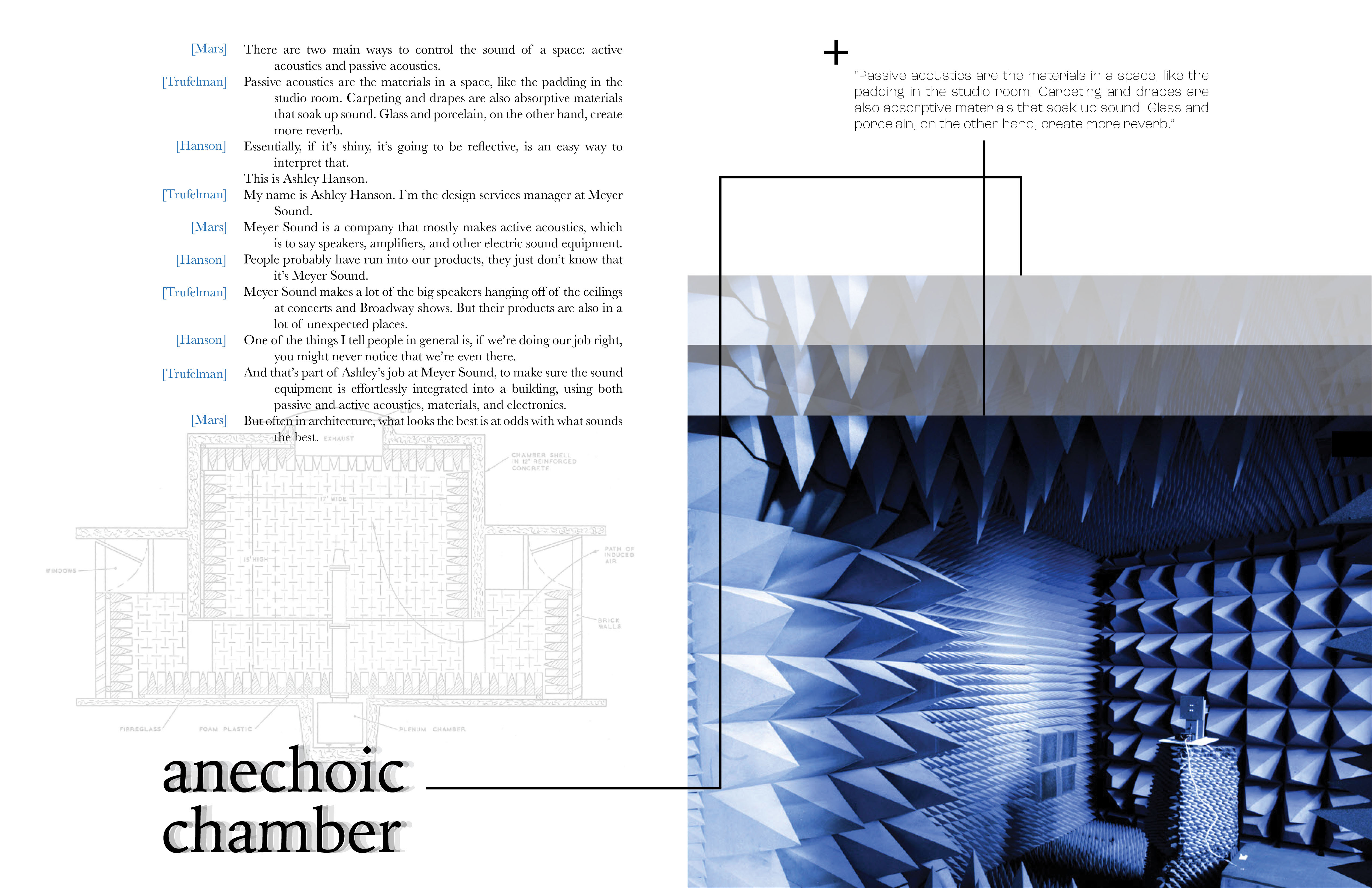
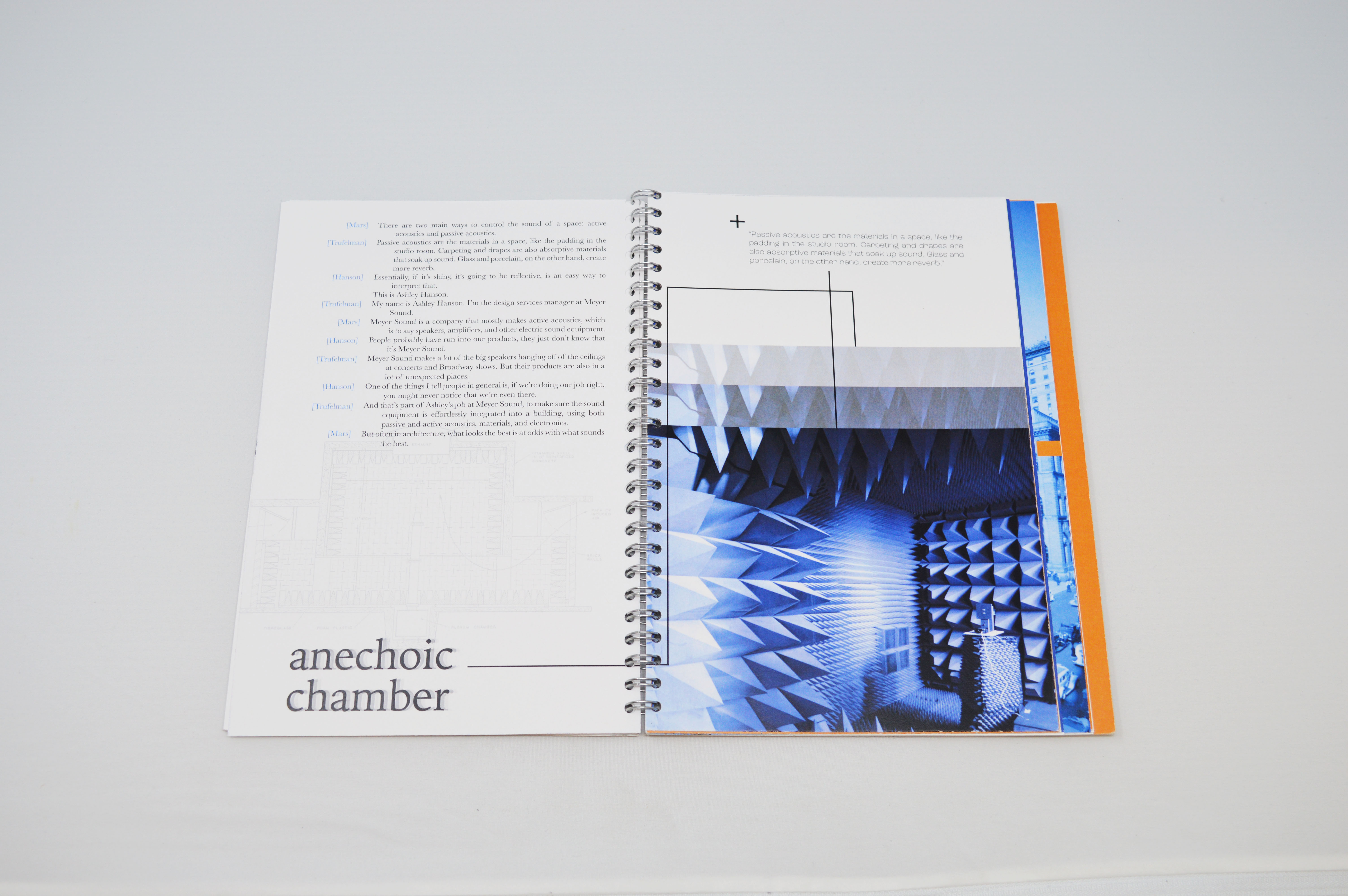
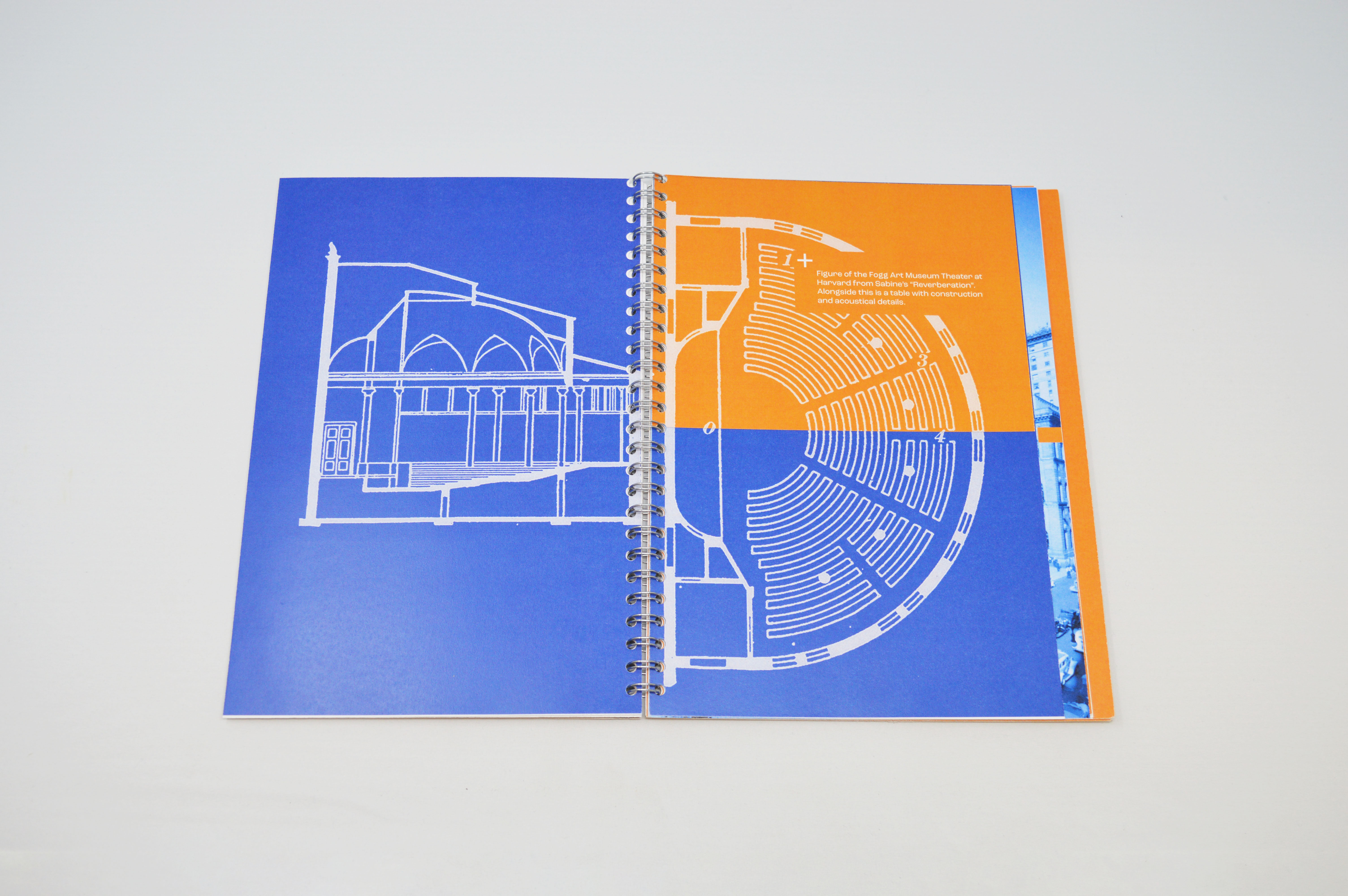
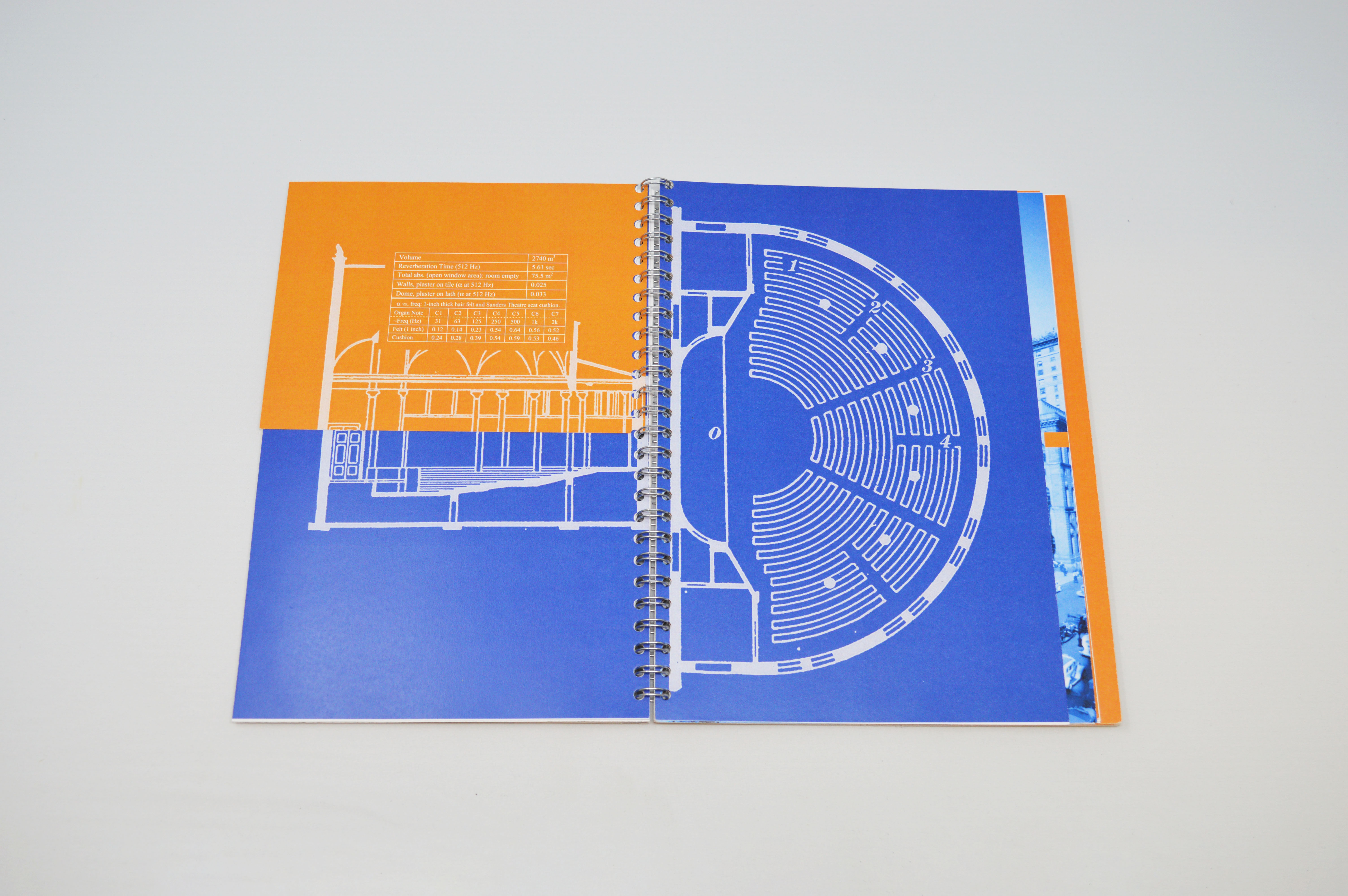
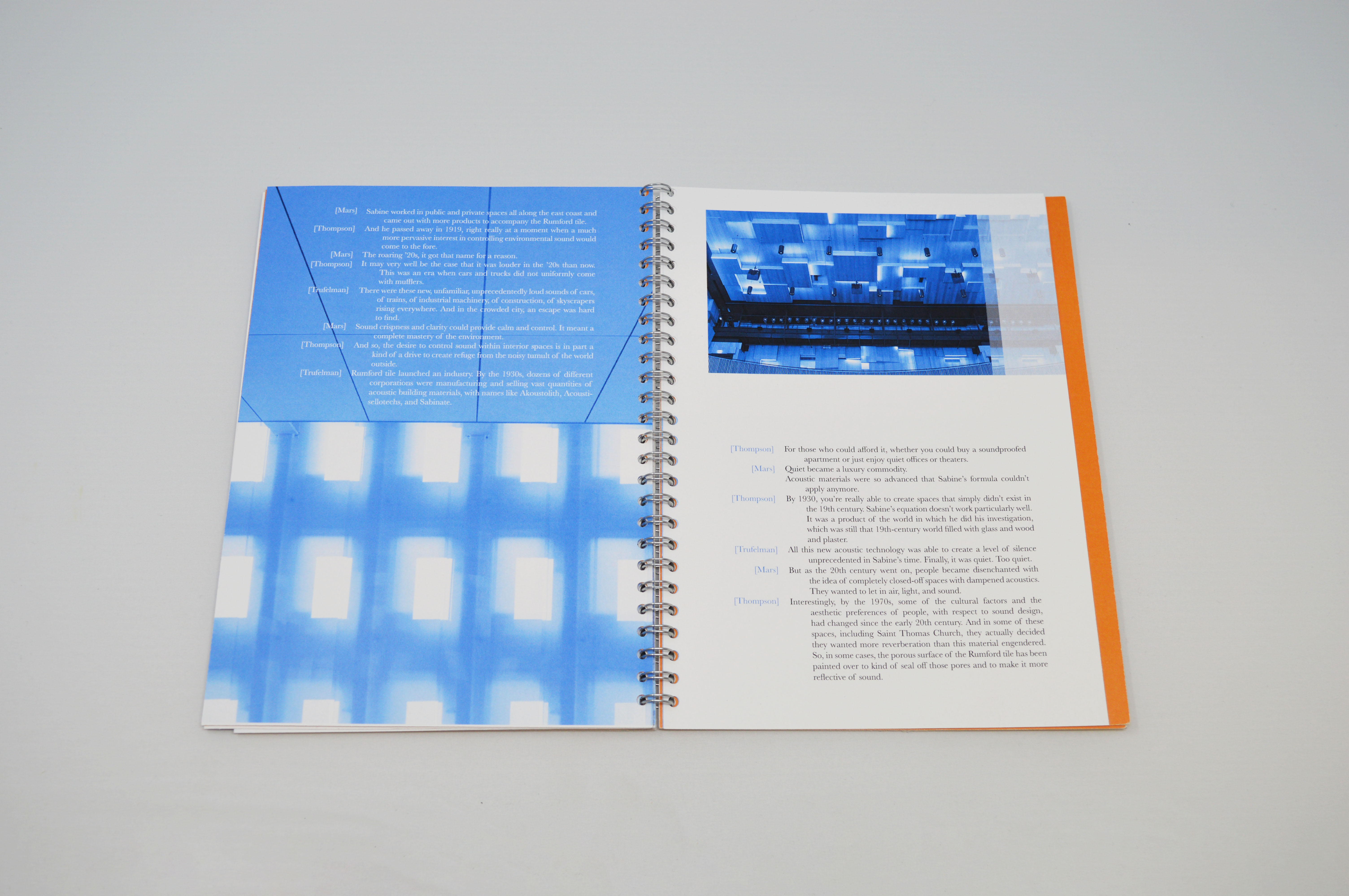
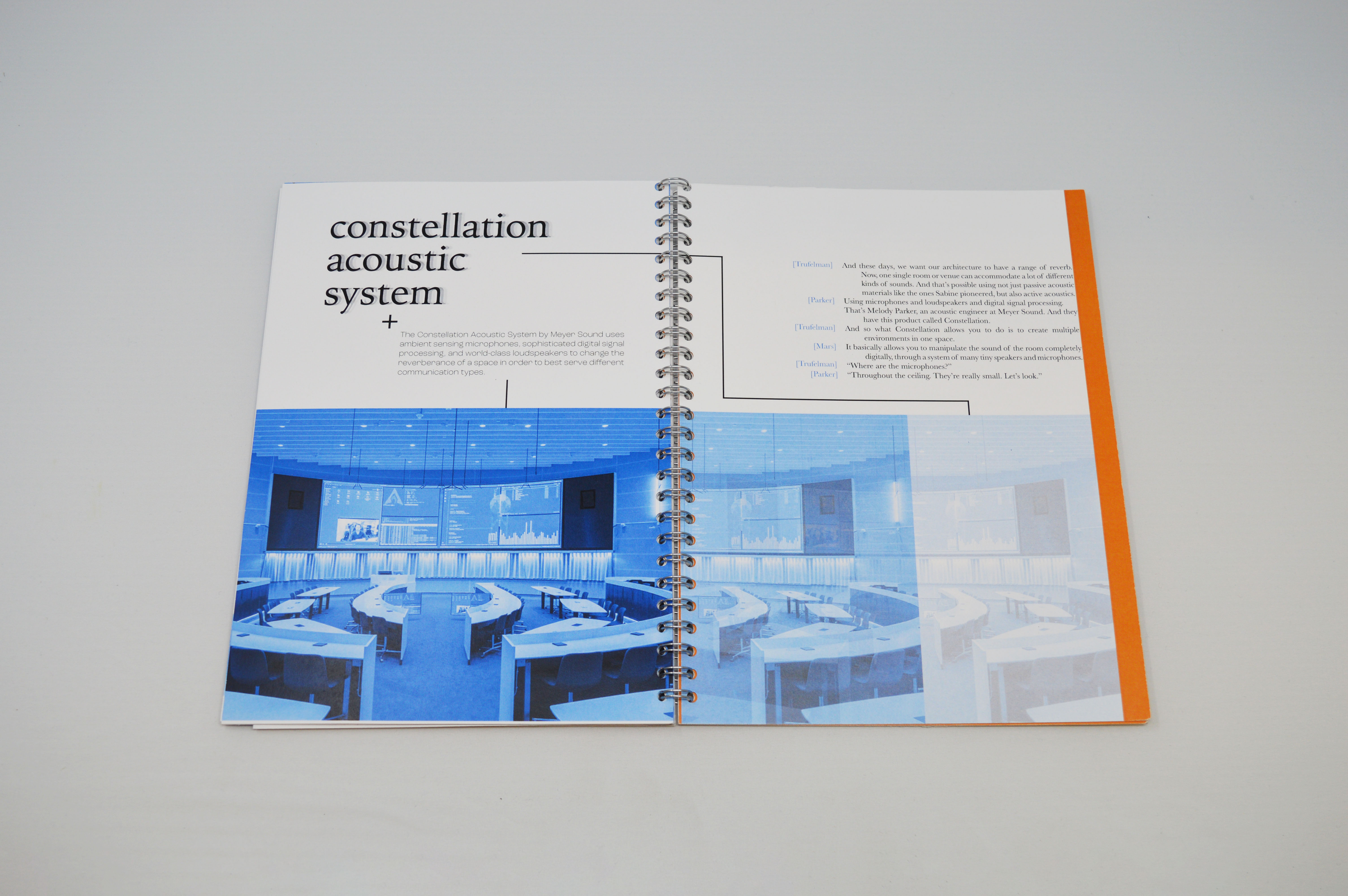
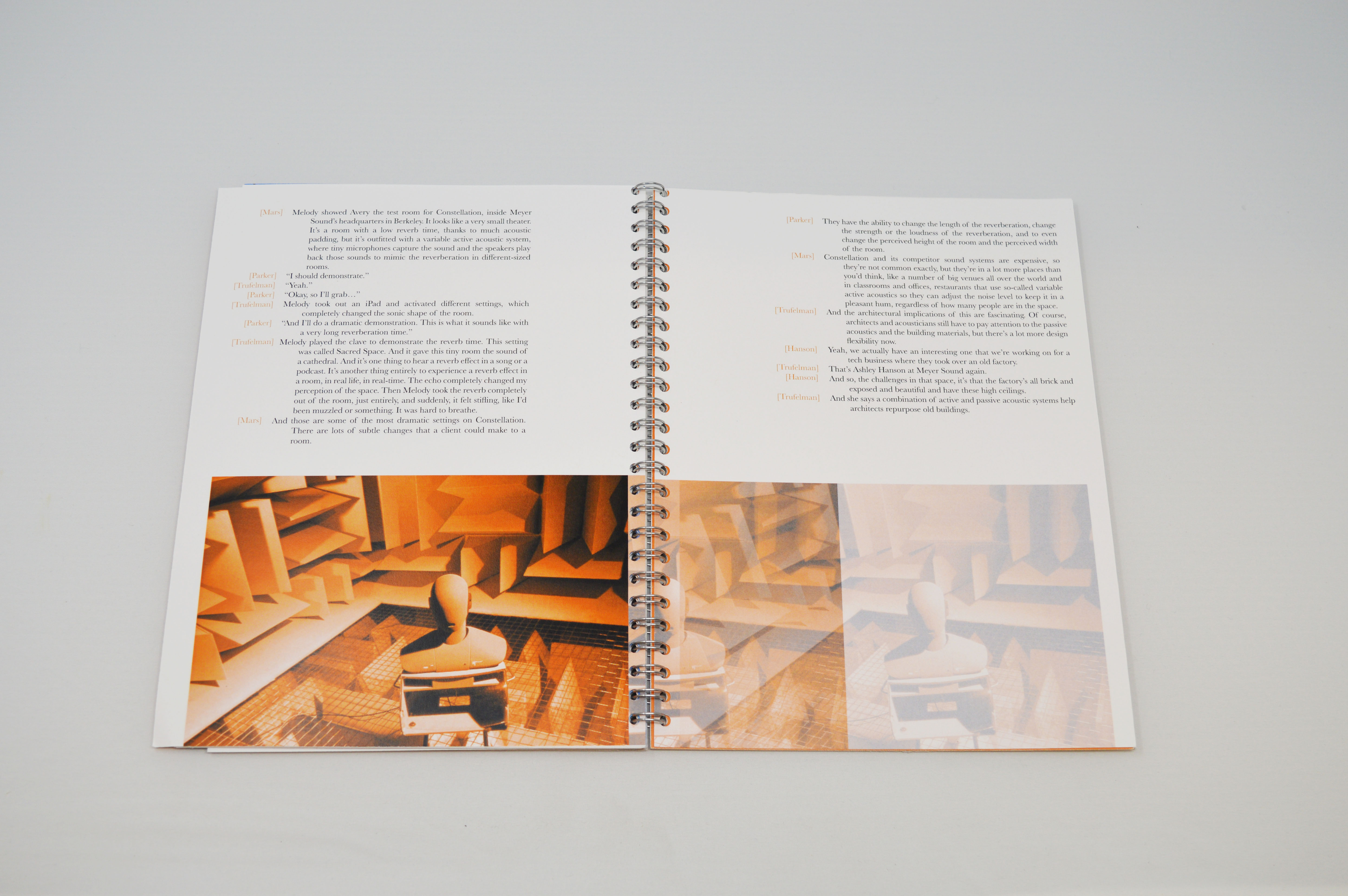
This part of the podcast goes into "passive acoustics"; I brought in a picture and a blueprint of an anechoic chamber as an example of how passive acoustics can be used to design the sound of a space. The book is set up in this way in many sections. It shows real world examples that are being mentioned in the podcast, along with a blueprint that alludes to the mathematics and science that goes behind building those spaces.
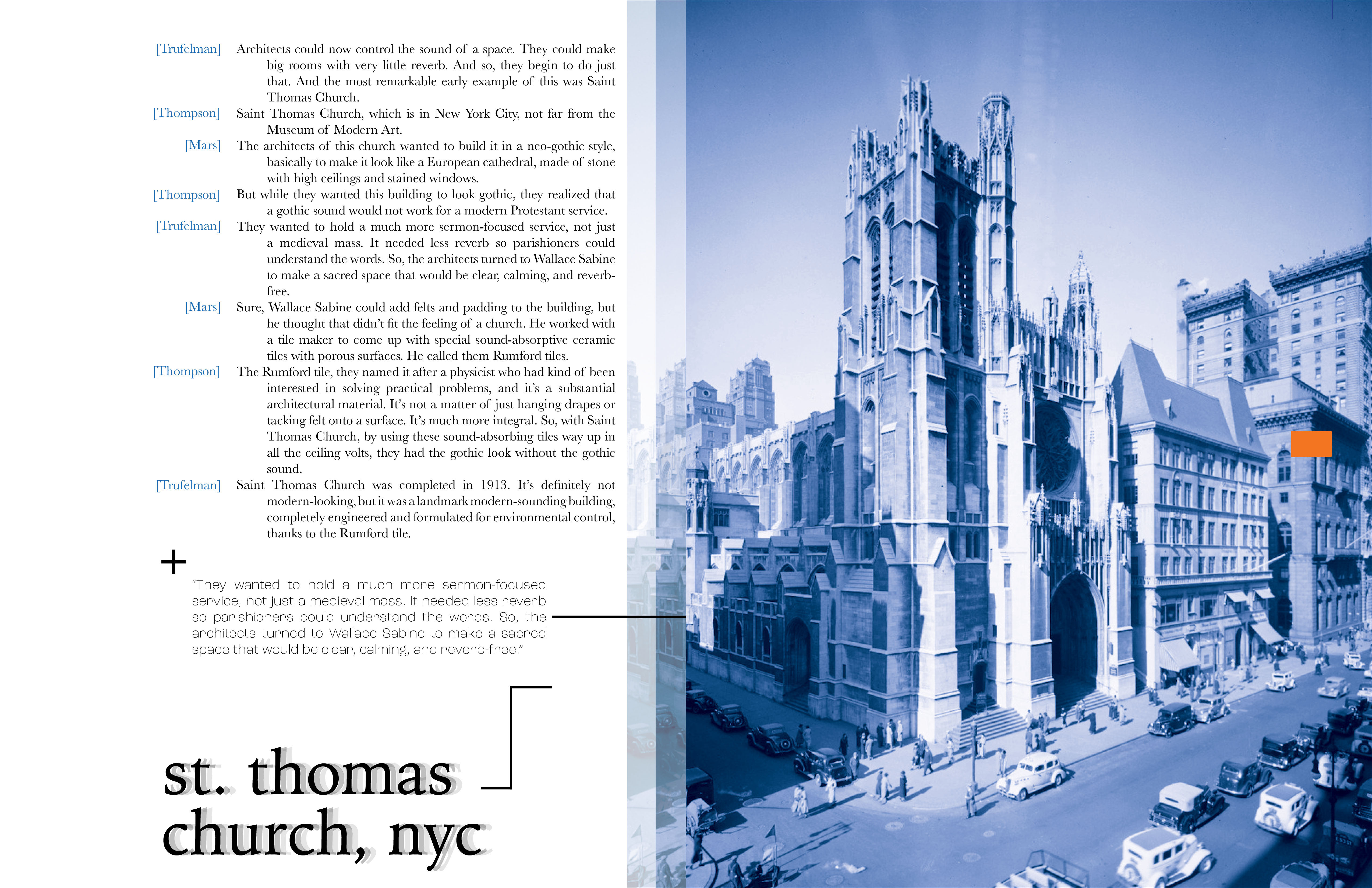
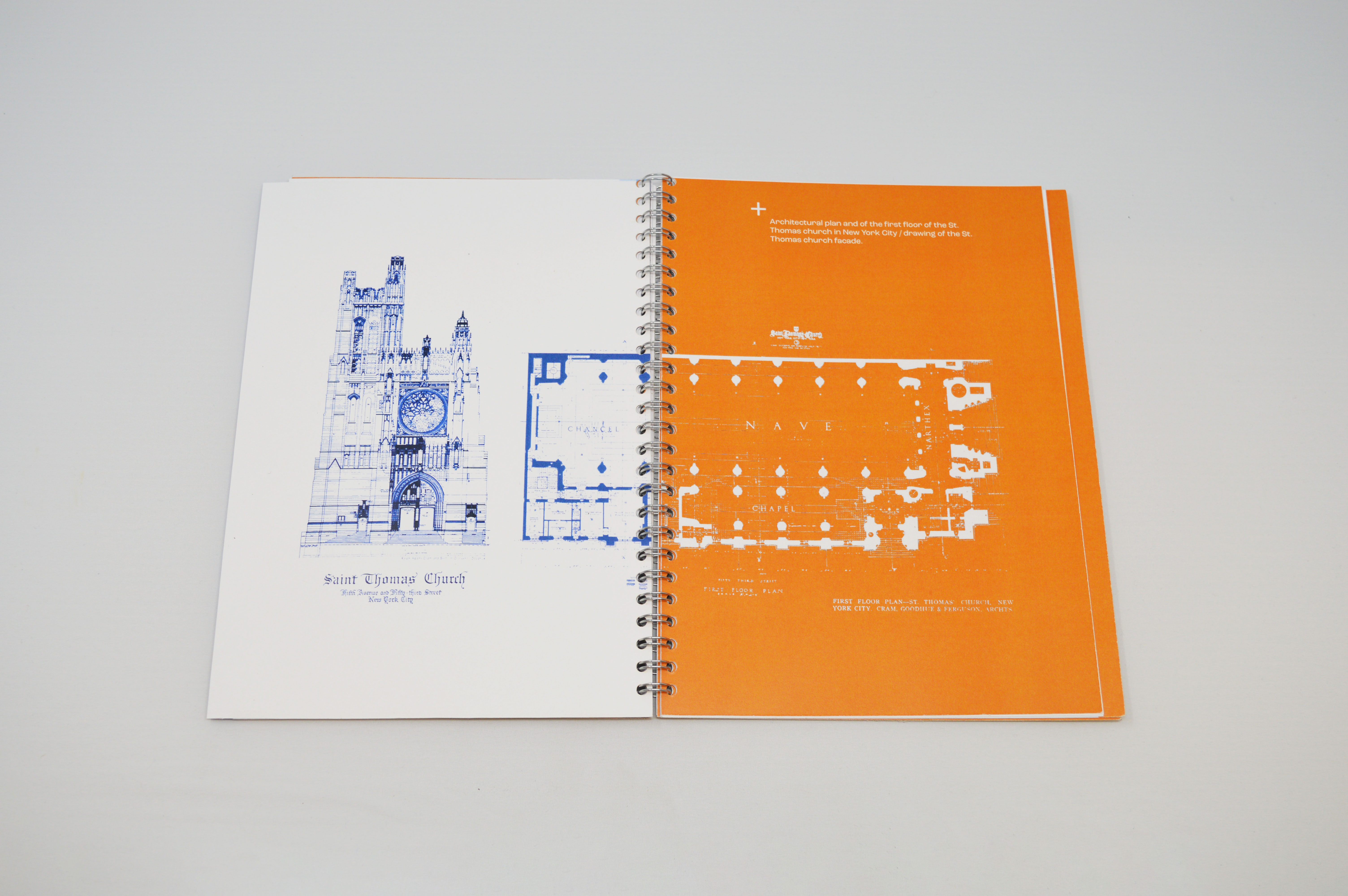
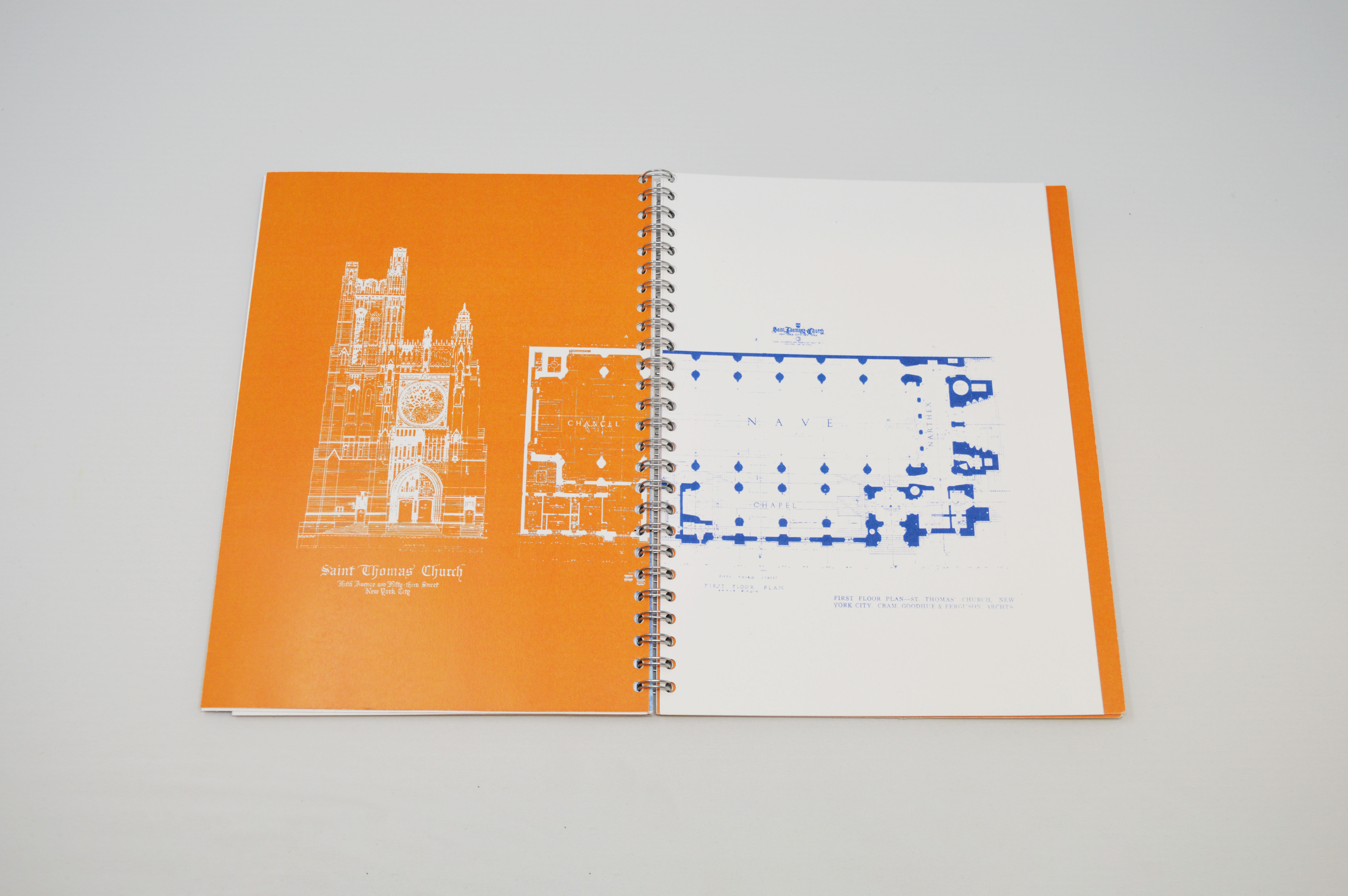
This treatment of the picture of St. Thomas church and its title is a recurring motif in the book. By having text and images leave a repeating ghosting path, I am tying the visual language back to the idea of reverb and sound.
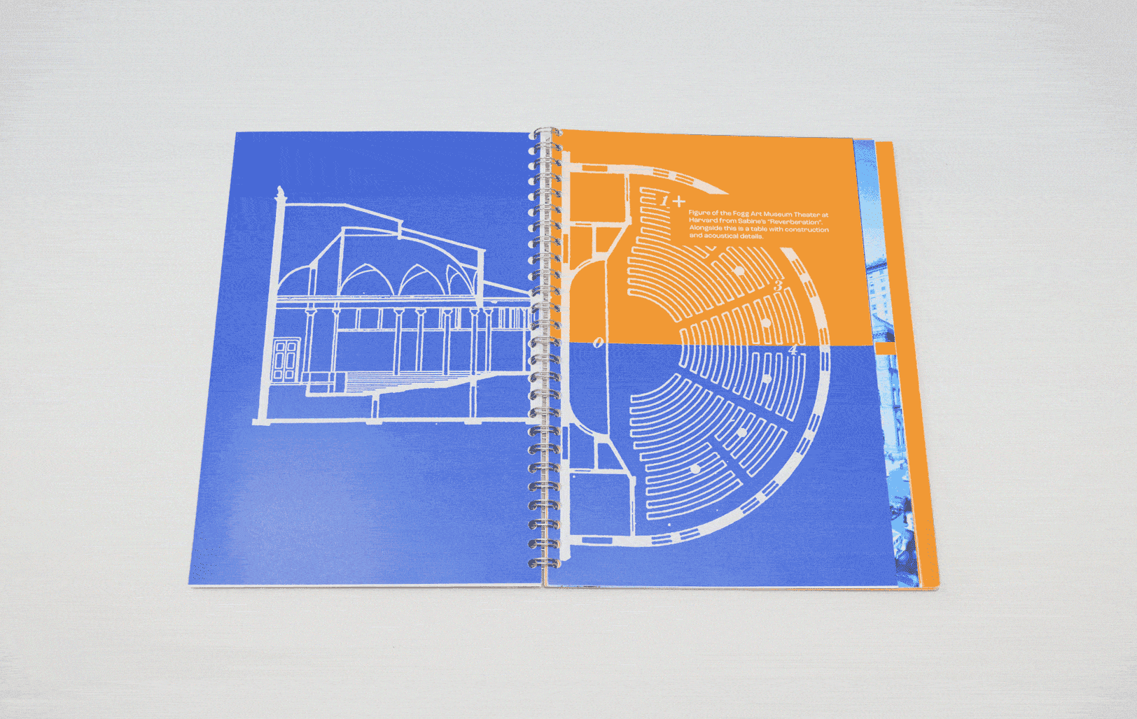
The half-pages in this book as well as the page sizes are really important. I use the half pages to add extra information throughout the book as well
as to give the sensation of the blueprints or pictures leaving behind an imprint or an echo on the page before, another way to reference reverb and add visual interest.
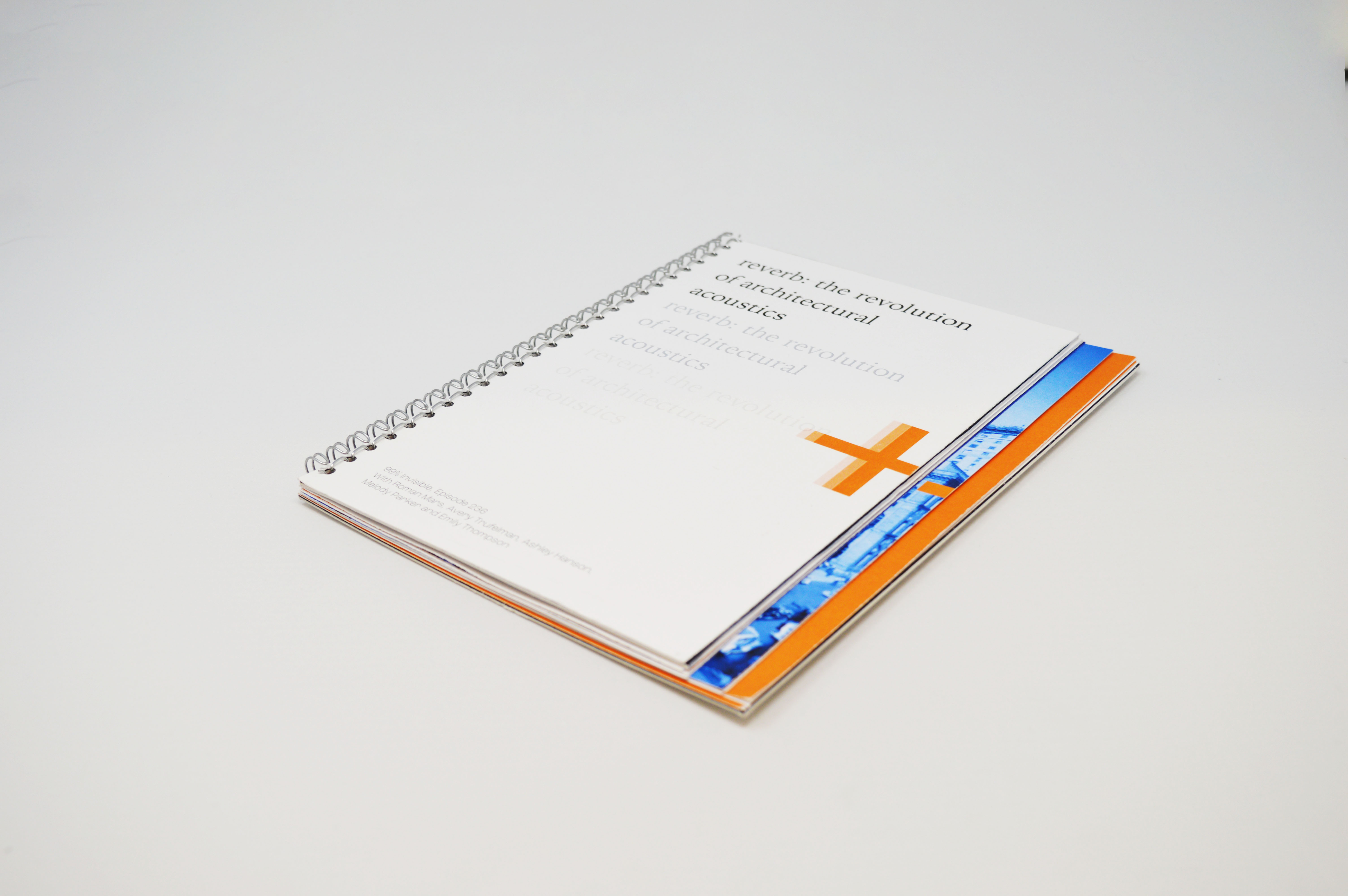
There are also three different sections of the book; each section's pages get longer as the book goes on, so that when you look at the book when it's closed,
there are three staggered layers of pages. This is a reference to how important architecture is to the topic. I wanted the book to physically feel like a solid, constructed
object to compliment the blueprints inside. The staggering again references reverb, and the metal coil spine adds even more to the industrial feel of the book.
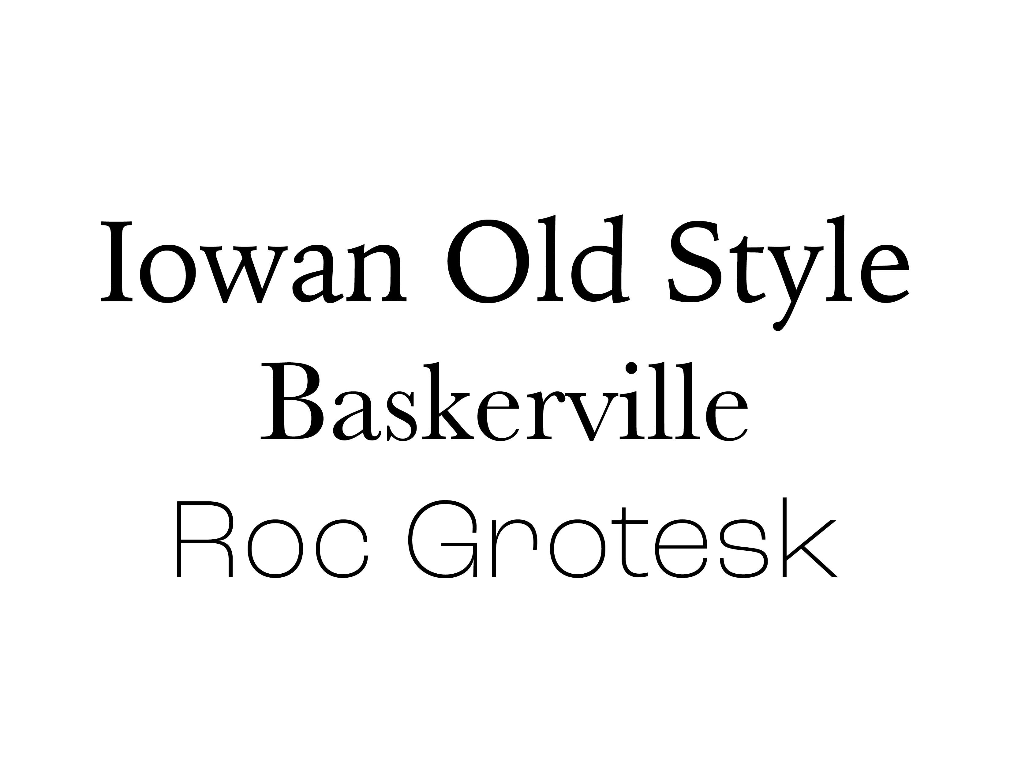
Typography was hugely important, and each typeface choice was thought out and picked to enhance the topic of the podcast and the visual cohesiveness of the book.
For the majority of the body copy, I went with Baskerville for its classic feel and readability. I wanted to go with an older serif typeface for the body because
the blueprints and the grid that the text is on already feels very technical. The podcast talks about these new technologies, but it begins with how these sound technologies were discovered in
the late 1860's, so I wanted a typeface like Baskerville to reflect this.
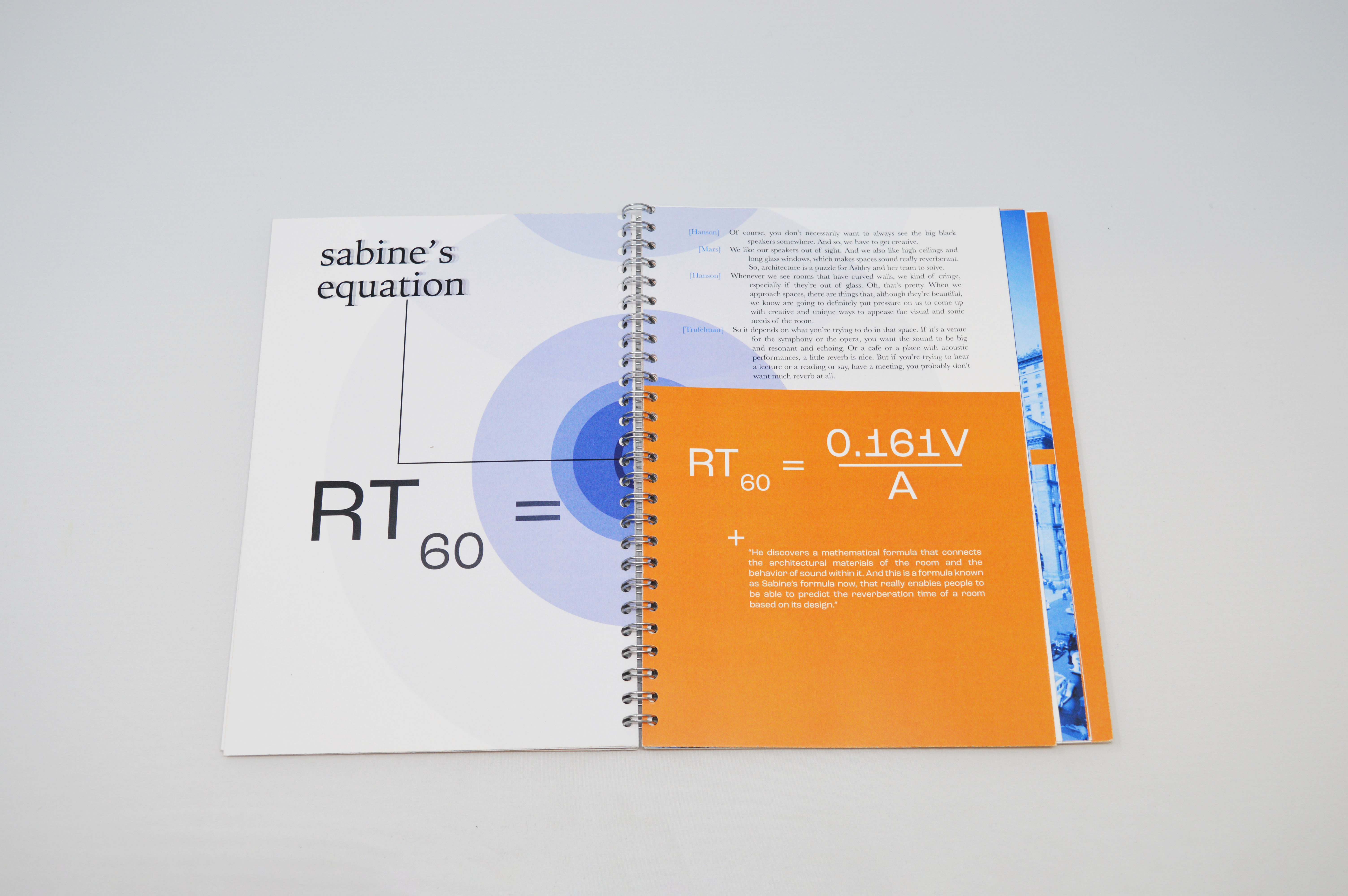
In that same vein, I went with a newer, mechanical sans serif, Roc Grotesk, for the technical pullouts and the things like math equations.
Finally, Iowan Old Style came to mind because I wanted something that kind of bridged the gap between the two for larger titles and the cover. While Iowan Old Style resembles older
serifs, designed in the 90s it has little details about it that make it look a little more modern and sleek. I also enjoyed how the tittles on the "i" and "j" are diamonds;
I think this gives it an almost gothic style, and compliments one the most mentioned examples of architectural acoustics in the podcast, St. Thomas church.
all spreads: